About my process
Content design lives somewhere between the intersection of writing and visual design. Every project requires an in-depth understanding of the material, trust-based relationships with stakeholders, and a creative approach to site architecture and page layouts.
Redesigning the intranet pages for RBC partnering
Role: Lead content designer
Team: Content designer, page owner, and SME
Company: RBC Wealth Management
Objective: Unify the disparate approaches to the partnering content so users could clearly understand the firm-led strategy and make action-oriented decisions.
Project context
The partnering team at RBC Wealth Management helps investment advisors find benefits for their high net worth clients. This is part of a larger firm-led approach to acquiring and retaining clients. However, investment advisors were rarely signing up for the partnerships because the content available to them was poorly written, out of date, and difficult to navigate. They were missing out on value-add opportunities for both their business and clients.
When a new leader joined the department, he asked us to create a content strategy to address these issues.
With over a dozen pages, ten different offerings, and an inconsistent page hierarchy, we needed to concisely distill the benefits of the offerings, meet the advisors where they were, and offer a clear path of action for every opportunity.
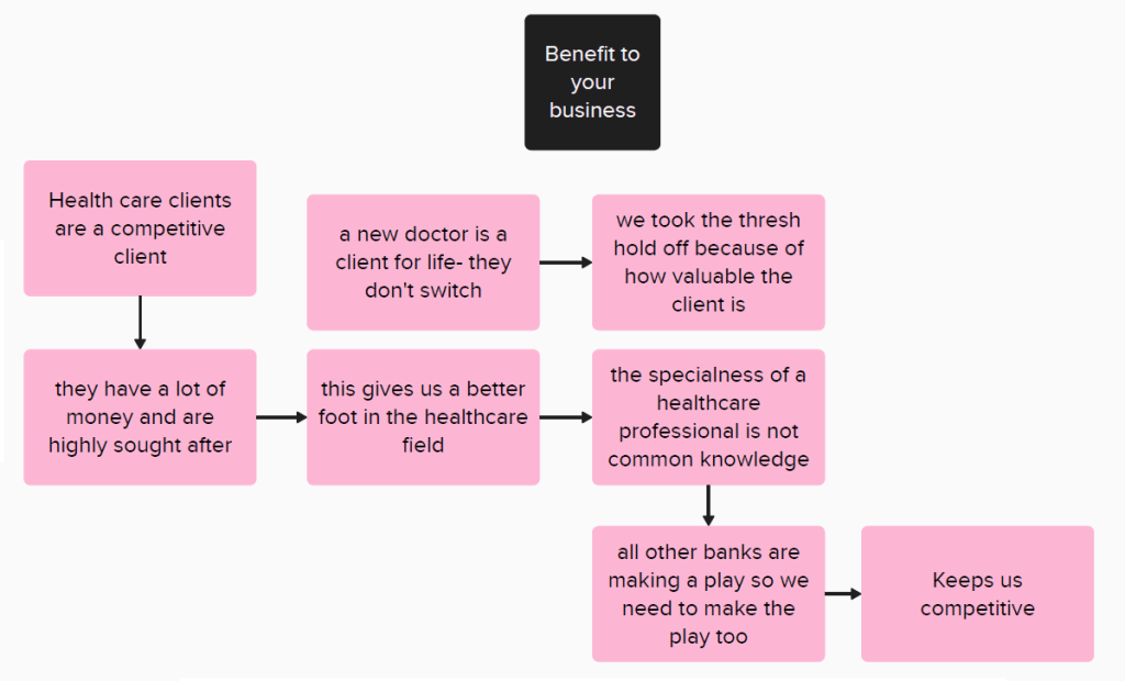
Due to proprietary ownership, I’m unable to provide visual examples or writing samples of the final result. This case study outlines my process with a few artifacts from our brainstorming sessions.
Scope out the content and discover user needs
We began with a thorough content audit of each page. The audit covered links, assets, and CTAs. We shared the audit with the stakeholder and asked him to identify what to keep, update, or delete.
At the same time, we built a visual map of the pages so we could see how users arrived at each piece of content. With internal metrics, we learned there was a high bounce-rate, brief read-times, and very few click-throughs into explanatory documents.
From there, we looked at how the content fit into the narrative the stakeholder was trying to present and started piecing together a new site structure to facilitate that.


Defining the problem
We crafted first-impression user statements using the words “As a user / I want / so I can”. These initial statements helped us see that the benefits weren’t always immediately clear.
After all: why would an advisor choose to go through the effort of acting on a partnership if it wasn’t immediately obvious how it could help their business?
With this in mind, we took stock of all the supporting material to build in-depth knowledge of the differentiating factors. We spoke with subject matter experts about how advisors behave and think and refined our user statements so they drilled into the what, why, and how of the problem.
Well-defined user needs provide clear writing objectives
- Users experience this content on an intranet, a platform primarily designed for how-to guides and day-to-day needs.
- Users are busy: they may only have a few minutes to look at these pages between client meetings and other duties.
- Users are resistant to change and often need to be coaxed into adopting new behaviours.
Execute the content strategy and information hierarchy around user needs
Since partnering is an optional value-add service, we decided to treat our approach like a purchase journey to build better buy-in.
We structured the subjects within each offering under 4 buckets:
- Overview: A brief description of the partnership using plain language
- Benefits: A direct address of the specific business advantages for the investment advisor’s business
- Eligibility: How to determine if a client qualifies for the offering
- Executing the opportunity: a didactic step-by-step guide for signing up
Testimonial
“The redesign of our landing pages has been so helpful in clarifying the path to execution for Advisors.
“These pages assist Advisors in gaining knowledge to make referrals to 13 bank partners and over 25K referrals annually. This redesign simplifies learning the process to refer. We will see a huge boost amongst our advisors in references to partners as part of our training for new Advisory teams.”
-Austin Armstrong, Director of Partnerships
Results
- Gutted the structure and rebuilt the navigation.
- Wrote brief, didactic statements explaining what each partnership can do for users.
- Applied the same design to each page to create visual familiarity and consistency.
- Wrote a new page about the partnership team and their objectives.
- Improved the SEO so the content showed up in internal search results.
- Adhered to plain language standards and avoided hype-phrasing more commonly found in marketing.
