About my process
UX writing, when done well, is like poetry: able to convey complex ideas, thoughts and processes through an efficient choice of words.
Project objectives for the post-workshop experience
Role: UX writer
Team: Product owner, UX designer, graphic designer
Company: ExperiencePoint
Objective:
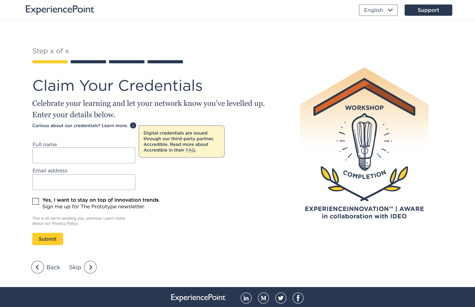
- Create page-flows for users to claim their workshop credentials.
- Direct users to sign-up for ExperiencePoint offerings, such as newsletters and other workshops.
Project background
ExperiencePoint launched workshop credentials in the summer of 2022. The credentials allowed users to pin their certificates to their LinkedIn page, offering proof of of skills.
The credentials also served as a passive word-of-mouth branding opportunity. Those who added their credentials to their feed may also write about the experience, helping drive new participants to the workshops.
Project requirements
We defined the tone as brief, friendly, and simple.
We needed to build a sign-up process sensitive to the participants’ willingness to complete it after 1-6 hours of intensive learning and remain mindful of cognitive load.
Over several weeks, I worked with the UX and UI designers, product owner, and stakeholders to craft encouraging language for the screens.
Methods and tools
- Design thinking strategies to conceive, iterate, test, and refine our process.
- Ditto Words app and Figma to script out activity instructions in their shortest form.
- Consultation with internal SMEs on participant behaviour, mood, and needs.
- User testing and a post-launch plan to use data to adapt the screen order based on completion rates
With modular copy, the product team could re-arrange the screen order for A/B testing
- With testing, we learned we wanted to rearrange the screen order based on post-design analytics.
- Every piece of copy after the initial sign-up screens needed to be modular and not suggest an order or place in the process.
- We iterated on the copy, gathering feedback from stakeholders, SMEs and the facilitators to validate our assumptions about how it should sound.
Result
Web and mobile-optimized UX writing that encouraged users to complete the steps and claim their credentials.
Have a look at the rest of the screens below.
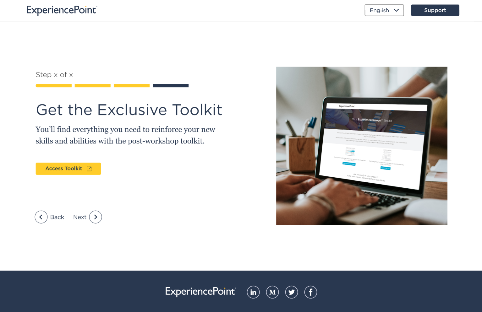
One of the modular screens offers a gentle nudge to encourage users to download the toolkit. 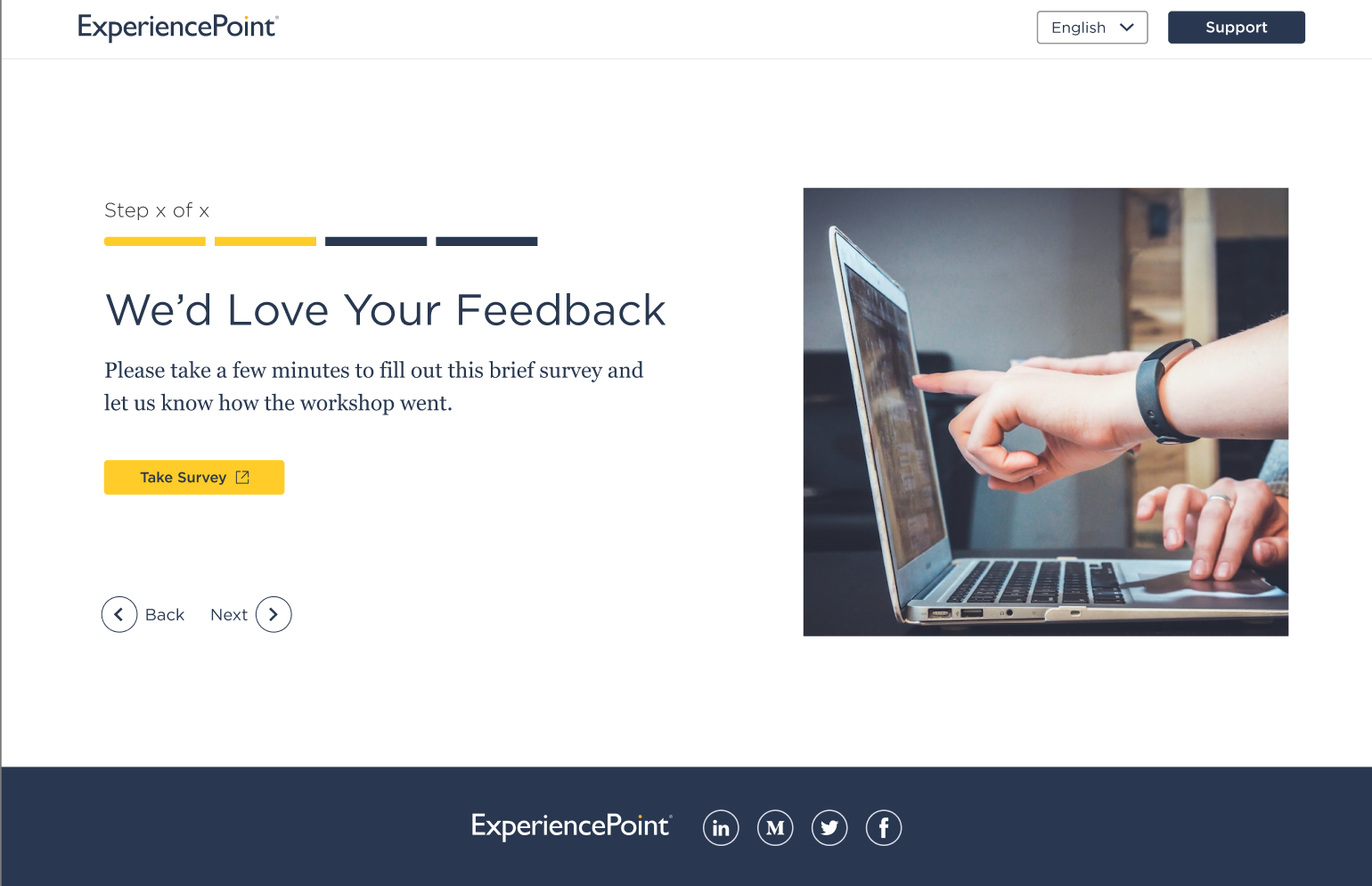
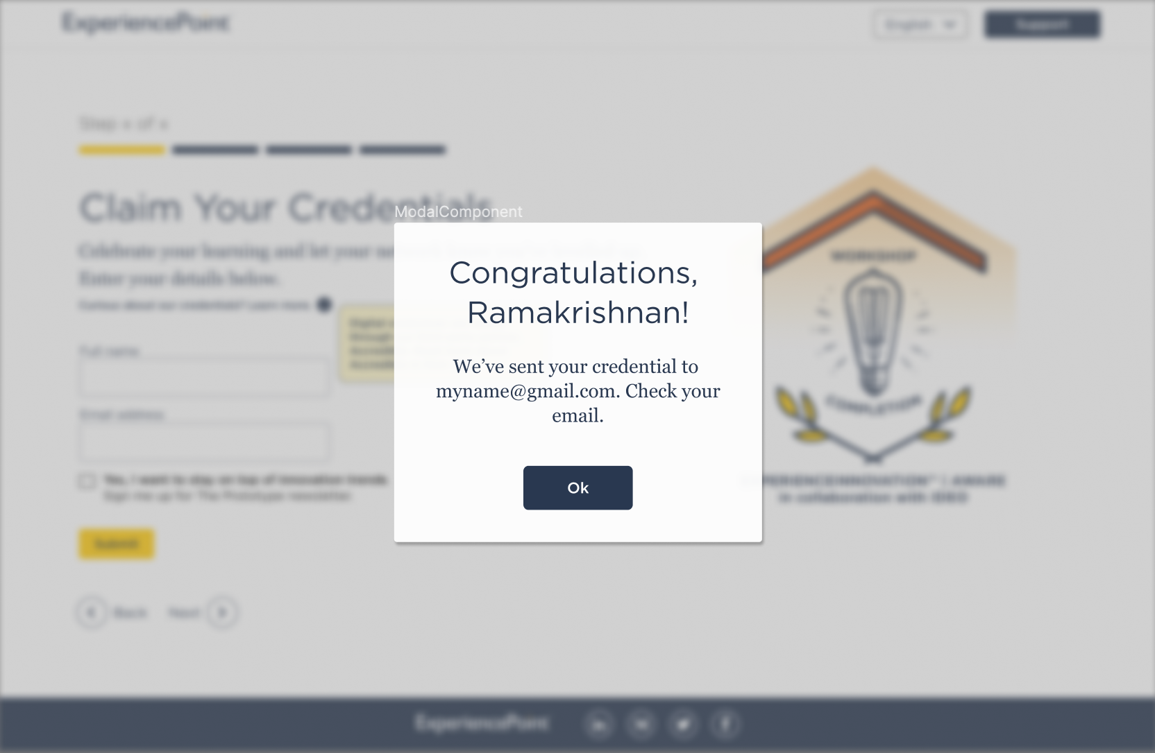
A modular screen asking the users to provide feedback. 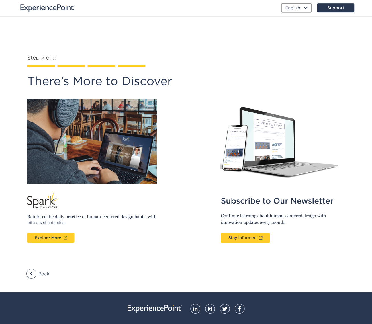
The product team wanted to try a gentle approach to get users to look at the other company offerings. This screen in the modular deck informs users of the Spark workshop and the newsletter. 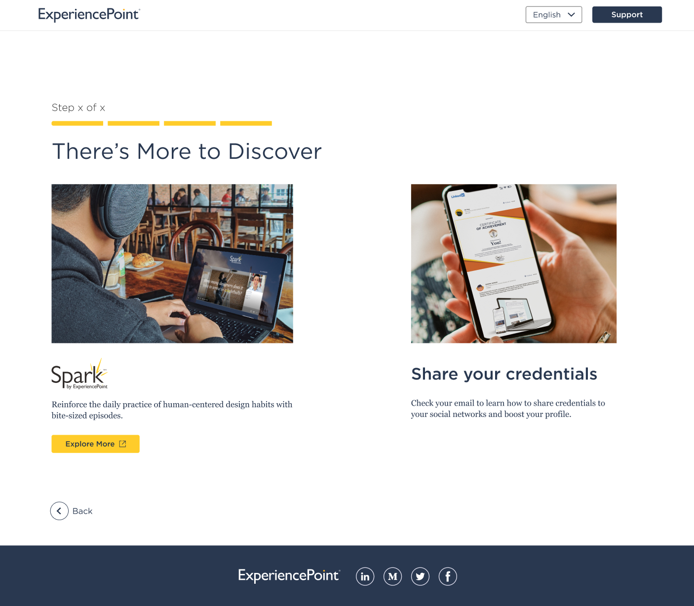
An modular screen designed to promote the company’s offerings while reminding the user to share their credentials on their social networks. 
An error screen informing the user they entered invalid sign-up information. 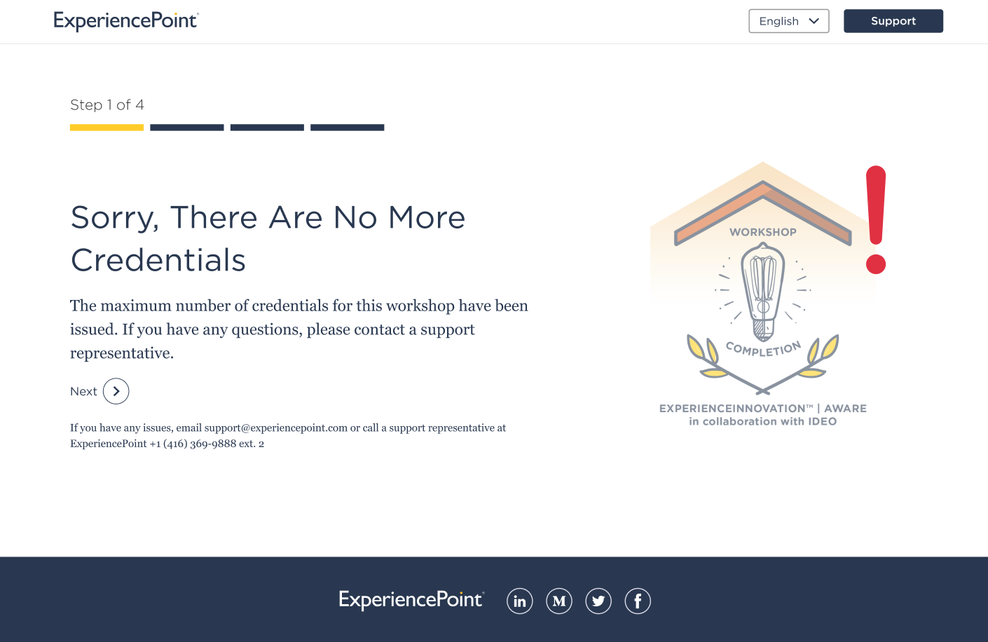
An error screen informing the user there are no more remaining credentials for the workshop. This was designed to prevent double-dipping with the credentials.
